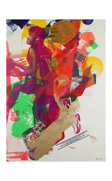
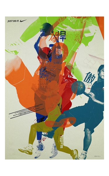
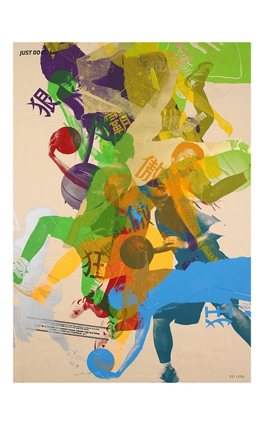
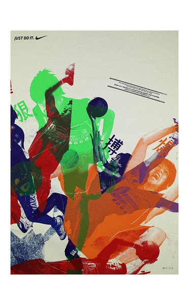
이번 칸느 광고영화제에서 옥외광고(Outdoor)부문 Bronze /디자인 부문 grandprix(그랑프리) 으로 선정된 Nike’s ‘Paper Battlefield’입니다.
나이키에서 주최하는 나이키 농구 리그를 홍보하기 위해서인데 만든 광고로
나이키는 나이키 농구 리그에서의 결과보다 이에 참여한 많은 열정을 안고 있는 선수들의 과정 자체가 매우 멋지고 아름답다는 것을
표현하고자 재미있는 포스터를 제작했습니다
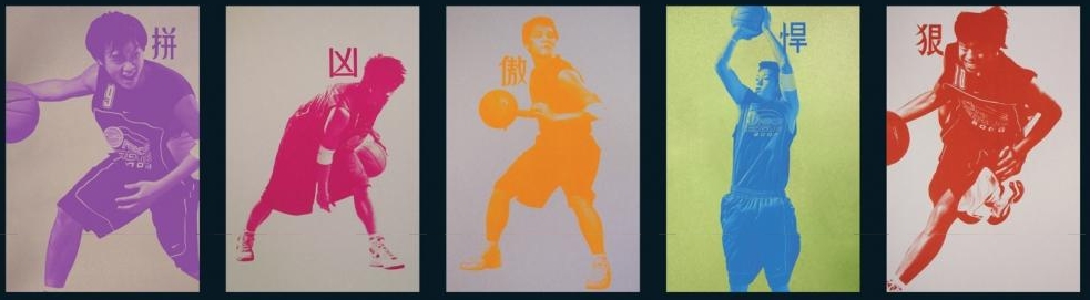
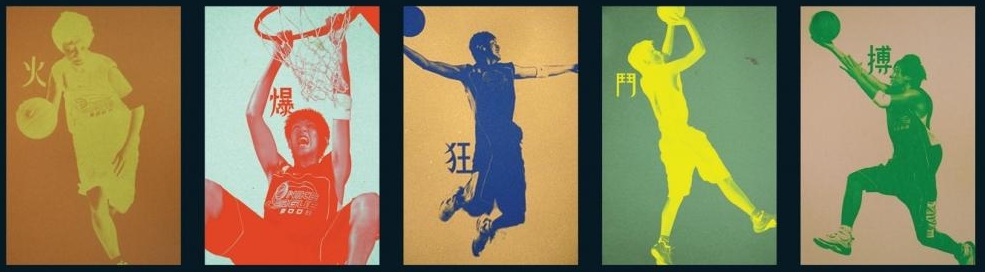
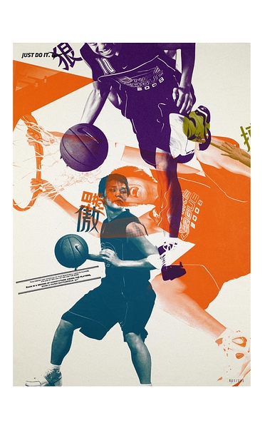
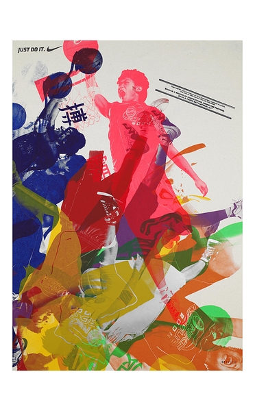
나이키 농구 리그에서 두각을 나타낸 10명의 선수들을 뽑아 그들의 멋진 농구 포즈를 실크스크린 형태로 제작하고
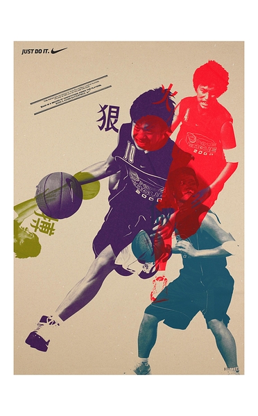
각각 선수들의 멋진 개성이 디자인된 실크스크린 판화를 다양한 컬러를 입히고 각도를 달리해 여러 선수들의 이미지를 한 포스터에
담아 마치 그들이 서로 멋진 농구 배틀을 하는 것처럼 보이게 했습니다.
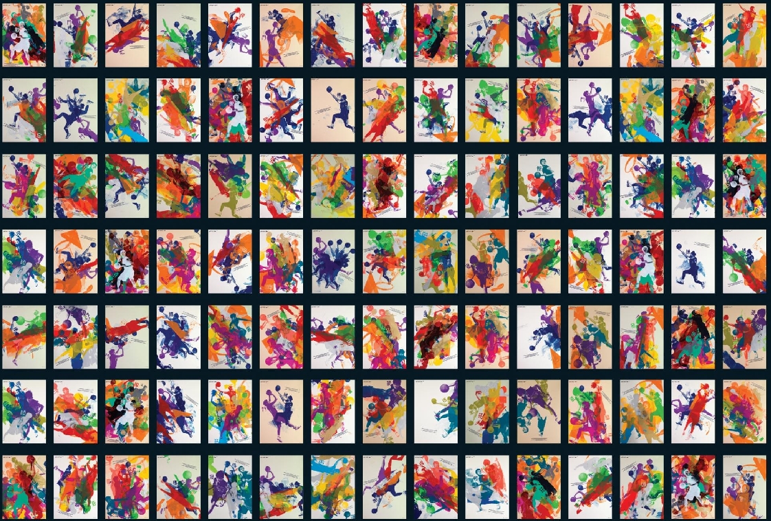
이런 기법으로 나이키는 10개의 실크스크린 판화를 가지고 총 350개의 포스터를 제작했다고 합니다.
Nike’s ‘Paper Battlefield’ Wins Cannes Design Grand Prix
Simplicity Trumps Innovation so Far at Ad Fest
By Teressa Iezzi Published: June 24, 2009
CANNES (AdAge.com) — There was no lack of technological innovation among the 1,100-plus Design Lions entries this year, but in awarding the Grand Prix to Nike’s “Paper Battlefield,” the 2009 jury saluted a platform that dates back to the 10th century: the silk screen.
Nike: Paper Battlefield
Created by McCann Worldgroup, Causeway Bay, Hong Kong, Paper Battlefield is a series of posters made by and featuring the teenage stars of the Nike Basketball League. The posters were designed to capture the energy of basketball competition as well as promote the games.
Photos of the league’s top 10 players in action formed the templates for the posters. The players themselves were then invited to a studio to create custom poster designs — silk-screening the images on top of one another in various combinations. As the case-study video and the judges noted, the “posters became the battlefield.”
The design jury, lead by Sylvia Vitale Rotta of Team Creatif in France, cited the campaign for its simplicity, its culture-spanning communication power and for embodying the marketer’s brand values. Jurors also lauded the effort for pushing the idea of what a poster can be.
“It was a new way of approaching poster design,” said Jennifer Morla of Morla Design, San Francisco.
“It was a socially distributed design process,” said juror Marc Shillum of R/GA. “It allowed the players to experiment and to have a battle as they would on the court.”
The design jury was reasonably generous, awarding a total of 22 Gold, 23 Silver and 37 Bronze Lions. Among the four U.S. Gold winners: the Nokia Vine brand identity and mobile application from R/GA; Fallon’s social-media aggregator, Skimmer; a style guide for Buick from Leo Burnett, Chicago; and Sapient’s interactive touch-screen vending machines for Coke. The U.S. won 11 Lions in all.
More winners from ad side
Gold Lions also went to BMW’s Kinetic Sculpture from Art & Com, Berlin, which has scooped up a host of prizes this year including a Black Pencil at the D&AD. Germany won 12 Lions in total, making it the most awarded country in design. The Zimbabwean’s “Trillion Dollar Campaign” effort, which won the Outdoor Grand Prix, was also awarded a Gold Design Lion.
The design winners list is notable for the number of ad agencies credited vs. design companies, and many of the winning entries do tend, as they did last year, to originate more in the advertising space than in design.
Ms. Vitale Rotta said the overall caliber of entries was high in this, the second year that Cannes has recognized design as a category (and entries in the design category were actually up this year, in contrast to awards entries in general, which have dipped with the economy).
There were three other entries in contention for the Grand Prix, Ms. Vitale Rotta said, though a cagey jury wouldn’t reveal their identities. In selecting “Paper Battlefield,” the design jury seemed to echo other Cannes juries’ predilection for simplicity over technical virtuosity or category-busting innovation.
“We liked that it was actually kind of low-tech,” said one of the design jurors. “It was just full of life and joy and energy. If we could have taken one thing home with us, that would have been it.”
출처 : http://adage.com
새롭게 뉴스레터를 시작했습니다.
1️⃣ 주식 등 투자 정보 : 기업 분석, IB 투자의견 등 투자 관련 내용
..... 테슬라 실적 및 IB들의의 테슬라 투자의견
2️⃣ 사례 및 트렌드 : 사례연구와 트렌드 관련 괜찮은 내용
.....유튜브와 경쟁대신 구독 전환한 비디오 플래폼 비메오 사례